© A.I. McLeod and S.B. Provost, February 4, 2001.
Multivariate analysis deals with the statistical analysis of observations where there are multiple responses on each observational unit. Let ![]() be an
be an ![]() data matrix where the rows represent observations and the columns, variables. We will denote the variables by
data matrix where the rows represent observations and the columns, variables. We will denote the variables by ![]() In most cases, it is necessary to sphere the data by subtracting out the means and dividing by the standard deviations. If outliers are a possibility, then a robust sphering method such as that discussed by Venables and Ripley (1997, p.266) should also be tried too. Important special cases are
In most cases, it is necessary to sphere the data by subtracting out the means and dividing by the standard deviations. If outliers are a possibility, then a robust sphering method such as that discussed by Venables and Ripley (1997, p.266) should also be tried too. Important special cases are ![]() which correspond to univariate, bivariate and trivariate data.
which correspond to univariate, bivariate and trivariate data.
Multivariate data visualization is an exciting area of current research by statisticians, engineers and those involved in data mining. Comprehensive and in-depth approaches to multivariate data visualization which are supported by sophisticated and available software are given in the books by Cleveland (1993) and Swayne et al. (2001). Beautifully executed and fascinating data visualizations presented with great insight are given in the books of Tufte (1983, 1990, 1993) and Wainer (1997). Surveys on data visualization are given in the articles by Weihs and Schmidli (1990), Wegman and Carr (1993) and Young et al. (1993). Visualization of categorical data is discussed in the monograph by Blasius and Greenacre (1998). The books of Everitt (1978) and Toit et al. (1986) are now dated but they still provide readable accounts of some classical techniques for multivariate visualization. There are many other more specialized books as well as research papers which we will discuss in later sections of this article. Software, web visualizations and other supplementary material for this article are available at the following site: http://www.stats.uwo.ca/faculty/aim/mviz.
This article first gives a brief overview of the most important current software available for data visualization and then discusses the general principles or philosophy involved in data visualization. This is followed by a discussion of some of the most interesting and useful multivariate graphical techniques.
Because data visualization is iterative and exploratory, it is best carried out in a comprehensive quantitative programming environment which has all the resources necessary not only for carrying out the data exploration and visualization but also necessary numeric, statistical and modeling computations as well as providing documentation capabilities.
Buckheit and Donoho (1995) make the case for higher standards in the reporting of research in computational and visualization science and they introduce the term QPE (quantitative programming environment) to describe a suitable computing environment which allows researchers to easily reproduce the published work. Just as mathematical notation is easy and natural for researchers, QPEs must provide a programming language which is also easy, natural and powerful. Currently there are three very widely used QPEs and as well as many others under development or less widely used. The three most widely used QPEs used in data visualization are Mathematica, S/S-Plus/R and MatLab.
Mathematica has a very sophisticated and easy-to-use programming language as well as superb capabilities for graphics, numerics, symbolics and technical typesetting. Smith and Blachman (1995) provide an excellent introduction to Mathematica and its general graphics capabilities. This article was prepared in postscript form using Mathematica. Graphics from Mathematica as well as S-Plus and MatLab were incorporated in the article.
S/S-Plus/R also provide an excellent QPE for researchers in statistics and data visualization, see Venables and Ripley (1997) for a comprehensive introduction. Users of linux can incorporate the powerful XGobi software into S/S-Plus/R as a library. Furthermore, S-Plus provides a complete implementation, in unix and windows, of the techniques of Cleveland (1993) in their trellis software and R provides a partial implementation via the coplot function. Many of the graphics in this article were produced in S-Plus. R (available at the website: http://www.r-project.org/) is a particularly noteworthy development in statistical computing since it provides a comprehensive and high quality QPE which is freely available over the web. Both S-Plus and R have a large base of contributed software archived on the web at StatLib (http://lib.stat.cmu.edu).
MatLab is another QPE which is widely used perhaps more so by engineers and applied mathematicians. The MatLab programming language is not unsimilar to S/S-Plus/R in its use of scripts and vectorization of computations. MatLab has superb state-of-the-art graphics capabilities. There are many freely available toolboxes developed by users and we make use of one of these for the Self-Organizing Map (SOM) visualization.
Yet another high quality environment for research is provided by Lisp-stat developed by Tierney (1990). Like R, Lisp-stat is available for free and works on linux, windows and other systems. Cook and Weisberg (1994) have developed a comprehensive and advanced software package for regression graphics using Lisp-stat. The principal developers of S, R and Lisp-stat who have been joined by many others are developing an exciting new statistical computing environment, Omegahat, which is currently available at the alpha stage.
Wilkinson (1999) and Wilkinson et al. (2000) describe an object-oriented approach to graphical specification which is being implemented as a Java Web-based interactive graphics component library called GPL.
Other popular statistical software packages and environments such as Stata, SPSS, Minitab and SAS provide various limited visualization capabilities. In general, these environments provide more structured and cookbook types of analyses rather than the more creative approach which is needed for successful visualization in state-of-the-art research and practice.
In addition to these popular computing environments, there are many other excellent individual packages such as XGobi, XGvis, Orca, and SOM_PAK which are freely available via the web -- see our mviz website for links, datasets and scripts.
Cleveland (1993, 1994) provides a comprehensive account of the process and practice of data visualization. An important general principle to be extracted from Cleveland's book is that successful data visualization is iterative and that there is usually no single graphic which is uniformly the best. Part of the iterative process involves making suitable data transformations such as taking logs, choosing the best form for the variables or more generally removing some source of variation using an appropriate smoother and examining what is left. These steps often require significant intellectual effort. Another part of the iterative process involves looking at different views of the data with various graphical techniques. Cleveland (1993) analyzes in this way numerous interesting datasets and provides scripts in S-Plus to produce all the graphics in his book. These scripts are very helpful in mastering the S-Plus Trellis Graphics system. In simple terms, S-Plus trellis graphics provided coordinated multipanel displays.
XGobi may be run as an S-Plus/R library and it provides state-of-the-art capabilities for dynamic data visualization. As an alternative to multipanel displays, we can examine with XGobi an animation or movie showing linked views of all the panels. Its interactive capabilities include subsetting, labelling, brushing, drilling-down, rotating and animation, and these capabilities are combined with grand tours, projection pursuit, canonical pursuit, 3D point clouds, scatterplot matrices and parallel coordinate plots to give the user multiple linked views of the data. A users guide for XGobi is available on the XGobi webpage (http://www.research.att.com/areas/stat/xgobi/) and it is the subject a forthcoming monograph (Swayne et al. 2001). XGobi represents the partial sum of the last twenty years of research in multivariate visualization (Buja et al., 1996).
From the technical graphics viewpoint, bivariate data is much better understood. Even with higher dimensional data we are often interested in looking at two dimensional projections. Scott (1992, p.3) speculates that really high dimensional strong interactions among all the variables is probably quite rare and that most of the interesting features occur in lower dimensional manifolds. Thus the bivariate and trivariate cases are very important.
The most important tools for revealing the structure of bivariate data are the scatterplot and its loess enhanced version (Cleveland, 1993, p.148). In the enhanced scatterplot, two loess smooths are plotted on the same plot along with the data. One smooth shows ![]() vs.
vs. ![]() and the other
and the other ![]() vs.
vs. ![]() . There are many other useful techniques as well. Several generalizations of the bivariate boxplot are available but the most practical and useful seems to be that of Rousseeuw et al. (1999) who also provide S and MatLab code to implement their method. Bivariate histograms and back-to-back stem-and-leaf plots are also helpful in summarizing the distribution and should be used before bivariate density estimation is attempted. For the case of
. There are many other useful techniques as well. Several generalizations of the bivariate boxplot are available but the most practical and useful seems to be that of Rousseeuw et al. (1999) who also provide S and MatLab code to implement their method. Bivariate histograms and back-to-back stem-and-leaf plots are also helpful in summarizing the distribution and should be used before bivariate density estimation is attempted. For the case of ![]() large, Carr et al. (1987) suggest showing the density of points.
large, Carr et al. (1987) suggest showing the density of points.
If ![]() and
and ![]() are measured on the same scale, Tukey's mean-difference plot is helpful. This is nicely illustrated by Cleveland (1993, p.351) for ozone pollution data measured at two sites (Stamford and Yonkers). In Figure 1, the data are logged to the base 2; we then plotted the difference vs. the mean and added a loess smooth. This plot shows that there is increase in the percentage difference as the overall level of ozone increases. At the low end, the ozone concentration at Stamford is about 0.5
are measured on the same scale, Tukey's mean-difference plot is helpful. This is nicely illustrated by Cleveland (1993, p.351) for ozone pollution data measured at two sites (Stamford and Yonkers). In Figure 1, the data are logged to the base 2; we then plotted the difference vs. the mean and added a loess smooth. This plot shows that there is increase in the percentage difference as the overall level of ozone increases. At the low end, the ozone concentration at Stamford is about 0.5 ![]() higher and this increases to about
higher and this increases to about ![]() at the high end. In the untransformed domain, this increase corresponds to multiplicative factors of
at the high end. In the untransformed domain, this increase corresponds to multiplicative factors of ![]() and 1.9 respectively. Notice how much more informative this graphical analysis is than merely reporting a confidence interval for the difference in means!
and 1.9 respectively. Notice how much more informative this graphical analysis is than merely reporting a confidence interval for the difference in means!
Figure 1. Tukey mean-difference plot of ozone pollution at Stamford and Yonkers.
![[Graphics:Images/index_gr_15.gif]](Images/index_gr_15.gif)
Point clouds in 3D are the natural generalization of the scatterplot but to aid visualization it is necessary to be able to rotate them with a mouse and/or create an animation. Rotation using the mouse can be done with XGobi and also with the S-Plus spin and brush functions. These capabilities are also available in MatLab and with Mathematica if one uses the addon package Dynamic Visualizer. However, more insight is often gained by resorting to coplots and/or projection pursuit in XGobi. These and other techniques will now be discussed.
Scatterplot matrices show the pairwise scatterplots between the variables laid out in a matrix form and are equivalent to a projection of the data onto all pairs of coordinates axes. When ![]() is large, scatterplot matrices become unwieldy and, as an alternative, Murdoch and Chow (1994) represent only the correlations between variables using ellipses; they have provided an S-Plus/R library which implements this technique. In XGobi, one can view scatterplot matrices or, as an alternative, an animation running through all or selected pairwise combinations. Interactive brushing and labeling is also very useful with scatterplot matrices and is implemented in S-Plus and XGobi. As an illustrative example, consider the environmental data on ozone pollution discussed by Cleveland (1993, pp.272-292). This dataset consists of a response variable ozone and three explanatory variables radiation, temperature and wind which were measured on 111 consecutive days. For brevity we will respectively denote by O, R, Tp and W, the cube root of ozone concentration in ppm, the solar radiation measured in langleys, the daily maximum temperature in degrees Farenheit and the wind velocity -- more details on the data collection are given by Cleveland (1993, pp. 273-274). The cube root of ozone was chosen to make the univariate distribution more symmetrical. Use of a power transformation or logs to induce a more symmetrical distribution often simplifies the visualization. The graphical order of the panels starts at (1, 1) and proceeds horizontally to (2, 1), (3, 1) and (4, 1) along the bottom row. The pattern is repeated, so that the panel in the top right-hand corner has coordinates (4, 4). Note that although this order is the transpose of the natural matrix ordering, it is consistent with the coordinates used in an ordinary two dimensional scatterplot. Sliding along the bottom row, we see in the (2, 1) plot that O increases with R up to a point and then declines. In the (3, 1) plot we see that O generally increases with Tp but that the highest values of O does not occur at the highest Tp. Plot (4, 1) shows that O is inversely related to W. The (2, 3) plot shows a pattern reminiscent of the first (2, 1) plot; so it would seem that Tp and R provide very similar information. The (4, 2) and (4, 3) plots show that W is again inversely related to R and Tp.
is large, scatterplot matrices become unwieldy and, as an alternative, Murdoch and Chow (1994) represent only the correlations between variables using ellipses; they have provided an S-Plus/R library which implements this technique. In XGobi, one can view scatterplot matrices or, as an alternative, an animation running through all or selected pairwise combinations. Interactive brushing and labeling is also very useful with scatterplot matrices and is implemented in S-Plus and XGobi. As an illustrative example, consider the environmental data on ozone pollution discussed by Cleveland (1993, pp.272-292). This dataset consists of a response variable ozone and three explanatory variables radiation, temperature and wind which were measured on 111 consecutive days. For brevity we will respectively denote by O, R, Tp and W, the cube root of ozone concentration in ppm, the solar radiation measured in langleys, the daily maximum temperature in degrees Farenheit and the wind velocity -- more details on the data collection are given by Cleveland (1993, pp. 273-274). The cube root of ozone was chosen to make the univariate distribution more symmetrical. Use of a power transformation or logs to induce a more symmetrical distribution often simplifies the visualization. The graphical order of the panels starts at (1, 1) and proceeds horizontally to (2, 1), (3, 1) and (4, 1) along the bottom row. The pattern is repeated, so that the panel in the top right-hand corner has coordinates (4, 4). Note that although this order is the transpose of the natural matrix ordering, it is consistent with the coordinates used in an ordinary two dimensional scatterplot. Sliding along the bottom row, we see in the (2, 1) plot that O increases with R up to a point and then declines. In the (3, 1) plot we see that O generally increases with Tp but that the highest values of O does not occur at the highest Tp. Plot (4, 1) shows that O is inversely related to W. The (2, 3) plot shows a pattern reminiscent of the first (2, 1) plot; so it would seem that Tp and R provide very similar information. The (4, 2) and (4, 3) plots show that W is again inversely related to R and Tp.
Figure 2. Scatterplot matrix of environmental data W, Tp; R O.
![[Graphics:Images/index_gr_17.gif]](Images/index_gr_17.gif)
XGobi, MatLab and S-Plus allow one to rotate a 3D point cloud or scatterplot using the mouse. An interesting exercise which demonstrates the value of rotating point clouds is to detect the crystalline structure in the infamous RANDU random number generator, ![]() . Another interesting example is provided in the S-Plus dataset sliced.ball. Using the S-Plus brush or spin function, one can detect an empty region in a particular random configuration of points which are not detectable with scatterplot matrices. Huber (1987) gives an informative discussion.
. Another interesting example is provided in the S-Plus dataset sliced.ball. Using the S-Plus brush or spin function, one can detect an empty region in a particular random configuration of points which are not detectable with scatterplot matrices. Huber (1987) gives an informative discussion.
As an environmental example, consider the four dimension dataset (W, Tp, R, O) shown as a scatterplot matrix in Figure 2. By color coding the quartiles of ozone we can represent this data in a 3D point cloud (Figure 3). Using Mathematica's SpinShow function we can spin this plot around to help with the visualization. In XGobi, the four dimensional point cloud can be rotated automatically to choose viewpoints of interest by selecting a grand tour. Also in XGobi, projections of any selection of the ![]() variables to 3D point clouds may be viewed as an animated grand tour and/or projection/correlation pursuit guided tour.
variables to 3D point clouds may be viewed as an animated grand tour and/or projection/correlation pursuit guided tour.
Figure 3. 3D Scatterplot of environmental data (W, wind; Tp temperature; R radiation) and ozone (cube-root, color coded).
![[Graphics:Images/index_gr_20.gif]](Images/index_gr_20.gif)
![[Graphics:Images/index_gr_21.gif]](Images/index_gr_21.gif)
In nonparametric multivariate density estimation or loess smoothing, it is of interest to replace the data by a smooth curve or surface and visualize the result. An example is the benthic data of Millard and Neerchal (2001, p.694) where the benthic index and various longitudes and latitudes are visualized as a loess surface in 3D; see our mviz website for a movie of a fly-by of this surface produced using Mathematica's Dynamic Visualizer. Various techniques for visualizing higher-dimensional surfaces are discussed in Scott (1991), Cleveland (1993, 1994) and Wickham-Jones (1994).
Wand and Jones (1995) discuss the popular kernel smoothing method for multivariate density estimation and provide an S-Plus/R library, KernSmooth, for univariate and bivariate density estimation. Scott (1985) invented a computationally and statistically efficient method for estimating multivariate densities with large datasets using the average shifted histogram (ASH). Scott's ASH method has been efficiently implemented in C code with an interface to S-Plus/R and is available from StatLib. The monograph of Scott (1992) on nonparametric multivariate density estimation contains many intriguing examples as well as beautiful color renditions. O'Sullivan and Pawitan (1993) present an interesting method for estimating multivariate density using cluster computing and tomographic methods. Wavelet methods for multivariate density estimation are another recent innovation that are discussed in the book by Vidakovic (1999, Ch.7). For distributions with compact support the moment method of Provost (2001) is simple and computationally efficient. Prior to smoothing, it is important to examine univariate and bivariate histograms of the data (Scott, 1992, p.95). Bivariate densities may be represented by contour plots or as in Figure 9 by three-dimensional surfaces. Trivariate densities can be shown as 3D contour plots as in Scott (1992). Both Mathematica and MatLab provide 3D contour plotting. In Figure 9, we show an estimate of the bivariate density for the successive eruptions of the geyser Old Faithful, ![]() where
where ![]() denotes the duration of the
denotes the duration of the ![]() -th eruption of Old Faithful, (Scott, 1992, Appendix B.6). Our estimate and plot were produced in R using the KernSmooth package of Wand and Jones (1995) with smoothing parameter
-th eruption of Old Faithful, (Scott, 1992, Appendix B.6). Our estimate and plot were produced in R using the KernSmooth package of Wand and Jones (1995) with smoothing parameter ![]() . Figure 4 indicates that the joint distribution has three distinct modes as was found by Scott (1985, Figure 1.12).
. Figure 4 indicates that the joint distribution has three distinct modes as was found by Scott (1985, Figure 1.12).
Figure 4. Bivariate density estimate of duration of the successive eruptions of the geyser Old Faithful.
![[Graphics:Images/index_gr_26.gif]](Images/index_gr_26.gif)
Coplots (conditioning plots) and the more general trellis graphics often provide a great deal of insight beyond that given in scatterplot matrices or 3D point clouds. The basic idea of the coplot is to produce a highly coordinated multipanel display of scatterplots often enhanced by a smoother such as loess. A subset of the data is plotted in each panel for a fixed range of values of the given variables. Given variables used in adjacent panels are overlapping so as to provide a smooth transition between panels. Using as an example the environmental data shown in Figures 2 and 3, we plot O vs. R given Tp and W in Figure 5. The given variables Tp and W are each divided into four overlapping sets with about half the values in common between adjacent sets or shingles as Cleveland (1993) terms them. In the coplot below, we see that the shape and slope of the relationship between O and R changes as Tp increases, indicating an interaction effect between R and Tp. Comparing across the panels how the relationship between O and R changes for fixed Tp, we observe an indication of change in the shape of the curve in panels (4, 1), (4, 2), (4, 3) and (4, 4). This suggests that there may also be an interaction effect between W and R. In practice, one would also examine the coplot of O vs Tp given W and R as well as O vs W given R and Tp; these plots may be found in Cleveland (1993, pp.272-292).
Figure 5. Coplot of environmental data (W, wind; Tp temperature; R radiation) and ozone (O, cuberoot concentration). The plot shows O vs. R given Tp and W.
![[Graphics:Images/index_gr_27.gif]](Images/index_gr_27.gif)
Parallel coordinate plots for multivariate data analysis were introduced by Wegman (1990) and are further discussed in Wegman and Carr (1993). The coordinate axes are represented as parallel lines and a line segment joins each value. Thus, as the sample size increases, the plot tends to become more blurred. Parallel coordinate plots nevertheless can still be useful. They are implemented for example in XGobi. Parallel coordinate plots are somewhat reminiscent of Andrew's curves (Andrews, 1971) in that each point is represented by a line.
The parallel coordinate plot, Figure 6, for a subset of the ozone data shows how the first and fourth quartiles of ozone interact with the other variables.
Figure 6. Parallel coordinate plot for a subset of environmental data and ozone.
![[Graphics:Images/index_gr_28.gif]](Images/index_gr_28.gif)
![[Graphics:Images/index_gr_29.gif]](Images/index_gr_29.gif)
Let ![]() and
and ![]() denote the normalized eigenvectors corresponding to the two largest eigenvalues of the sample covariance matrix after any suitable transformations such as logging and/or sphering. Then the principal components defined by
denote the normalized eigenvectors corresponding to the two largest eigenvalues of the sample covariance matrix after any suitable transformations such as logging and/or sphering. Then the principal components defined by ![]() and
and ![]() may be plotted. There are two interpretations of this plot. The first is that the plotted variables
may be plotted. There are two interpretations of this plot. The first is that the plotted variables ![]() and
and ![]() are the two most important linear combinations of the data which account for the most variance subject to the constraints of orthogonality and fixed norm of the linear combination used. The second interpretation is that
are the two most important linear combinations of the data which account for the most variance subject to the constraints of orthogonality and fixed norm of the linear combination used. The second interpretation is that ![]() are the projection of the data which minimizes the Euclidean distances between the data on the plane and the data in
are the projection of the data which minimizes the Euclidean distances between the data on the plane and the data in ![]() -space. Note that in some cases we may be interested in those linear combinations with minimal variance. We may also look at more than two principal components and project the resulting point cloud onto two or three dimensions as is done in XGobi.
-space. Note that in some cases we may be interested in those linear combinations with minimal variance. We may also look at more than two principal components and project the resulting point cloud onto two or three dimensions as is done in XGobi.
The biplot (Gabriel, 1971; Gower and Hand, 1996) provides more information than the principal component plot. It may be derived as the least squares rank two approximation to ![]() which consists of
which consists of ![]() two-dimensional vectors. The first
two-dimensional vectors. The first ![]() vectors are formed from the data projected onto the first two principal components
vectors are formed from the data projected onto the first two principal components ![]() and
and ![]() . The next
. The next ![]() are the projections onto this subspace of the original coordinate axes,
are the projections onto this subspace of the original coordinate axes, ![]() , where
, where ![]() denotes the vector which has 1 in position
denotes the vector which has 1 in position ![]() and zero elsewhere. The length of these
and zero elsewhere. The length of these ![]() vectors is usually scaled to one unit of standard deviation of the associated variable,
vectors is usually scaled to one unit of standard deviation of the associated variable, ![]() . The separation between these
. The separation between these ![]() projections gives an indication of the degree of correlation between the variables. Large separation means low correlation. Notice that the projection of a data point
projections gives an indication of the degree of correlation between the variables. Large separation means low correlation. Notice that the projection of a data point ![]() into this subspace is simply
into this subspace is simply ![]() . The biplot can be extended to more than two dimensions. Our mviz website contains a Mathematica notebook with more details as well as a Mathematica implementation.
. The biplot can be extended to more than two dimensions. Our mviz website contains a Mathematica notebook with more details as well as a Mathematica implementation.
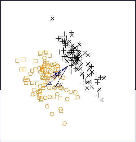
The Australian crab data (Venables and Ripley, 1973, §13.4; Swayne et al. 2001) provides an interesting visualization exercise. There are 200 crabs divided in groups of 50 according to gender (male and female) and species (Blue or Orange) and there are five measured variables denoted by FL, RW, CL, CW and BD. Venables and Ripley (1997, p.402) show how using a suitable data transformation is critical to a successful visualization with the biplot. New variables were constructed by dividing by the square root of an estimate of area, CL times CW and then the data was logged and mean corrected by gender. Without such a transformation, no difference is found in the biplot. The biplot, Figure 7, generated by the S-Plus biplot function, shows the crab data after the indicated transformations.
Figure 7. Biplot of the Australian crab data.
![[Graphics:Images/index_gr_52.gif]](Images/index_gr_52.gif)
Projections onto the principal coordinate axes are not always the most helpful or interesting. Projection pursuit (PP) generalizes the idea of principal components. In PP, we look at linear projections of the form ![]() where the direction
where the direction ![]() is chosen to optimize some criterion other than variance maximization. The PP-criterion is carefully chosen to indicate some feature of unusualness or non-normality or clustering. The original PP-criterion of Friedman and Tukey (1974) can be written
is chosen to optimize some criterion other than variance maximization. The PP-criterion is carefully chosen to indicate some feature of unusualness or non-normality or clustering. The original PP-criterion of Friedman and Tukey (1974) can be written ![]() where
where ![]() is a robust estimate of the spread of the projected data and
is a robust estimate of the spread of the projected data and ![]()
![]() describes the local density. Thus the degree to which the data are concentrated locally or the degree of spread globally are both examined. Typically there are many local maxima of
describes the local density. Thus the degree to which the data are concentrated locally or the degree of spread globally are both examined. Typically there are many local maxima of ![]() and they are all of potential interest. Friedman (1987) introduced another criterion which provides a better indication of clustering, multimodality and other types of nonlinear structures and can be rapidly computed via Hermite polynomials. This is the default method used in XGobi. Other methods available in XGobi are based on minimizing entropy, maximizing skewness and minimizing central mass. As the optimization is performed in XGobi, the current projection is viewed and this animation may be paused for closer inspection. Finding the crystalline structure in the multiplicative congruential generator RANDU and discriminating between a sphere which has points randomly located throughout its interior and another sphere that has the random points distributed on its surface are two interesting artificial examples which demonstrate the potential usefulness of projection pursuit.
and they are all of potential interest. Friedman (1987) introduced another criterion which provides a better indication of clustering, multimodality and other types of nonlinear structures and can be rapidly computed via Hermite polynomials. This is the default method used in XGobi. Other methods available in XGobi are based on minimizing entropy, maximizing skewness and minimizing central mass. As the optimization is performed in XGobi, the current projection is viewed and this animation may be paused for closer inspection. Finding the crystalline structure in the multiplicative congruential generator RANDU and discriminating between a sphere which has points randomly located throughout its interior and another sphere that has the random points distributed on its surface are two interesting artificial examples which demonstrate the potential usefulness of projection pursuit.
The untransformed Australian crab dataset using the variables FL, CL, CW and BD provides another illustration of the power of this method -- recall that a quite careful adjustment had to be made using the 2D biplot in order to successfully discriminate between the species. Figure 8 was obtained, using X-Gobi's PP-guided tour. The colors indicate the two species which are clearly seen to be different. This example is discussed in more detail in the forthcoming book by Swayne et al. (2001).
Figure 8. PP-XGobi plot of Australian crab using the untransformed variables FL, CL, CW and BD from a PP tour. The two species are color coded (black and orange) and the two genders are symbol coded (males □ and +; females Ο and ![]() ).
).
Multidimensional scaling (MDS) forms another body of techniques with an extensive literature. These methods are based on representing a high dimensional dataset with ![]() variables in a lower dimension
variables in a lower dimension ![]() , where typically
, where typically ![]() . A distance measure is defined for the data so
. A distance measure is defined for the data so ![]() distance between the
distance between the ![]() -th and
-th and ![]() -th rows of
-th rows of ![]() Then vectors of dimension
Then vectors of dimension ![]() are found by minimizing a stress function which indicates how well the lower dimension vectors do in representing the distances
are found by minimizing a stress function which indicates how well the lower dimension vectors do in representing the distances ![]() . In metric MDS, the stress function depends directly on the distances under a suitable metric. For example, if the Euclidean distance function is used with
. In metric MDS, the stress function depends directly on the distances under a suitable metric. For example, if the Euclidean distance function is used with ![]() then metric MDS is simply equivalent to plotting the first two principal components as we have already discussed. In the nonmetric version of MDS, the stress function is some more general monotonic function of the distances. XGvis (Buja et al., 2001) implements metric MDS visualization methods including such advanced features as 3D rotations, animation, linking, brushing and grand tours. A recent monograph treatment of MDS is given by Cox and Cox (1994) and a brief survey of MDS with S-Plus functions is given by Venables and Ripley (1997, p.385). Friedman and Rafsky (1981) discuss the use of MDS for the two-sample multivariate problem.
then metric MDS is simply equivalent to plotting the first two principal components as we have already discussed. In the nonmetric version of MDS, the stress function is some more general monotonic function of the distances. XGvis (Buja et al., 2001) implements metric MDS visualization methods including such advanced features as 3D rotations, animation, linking, brushing and grand tours. A recent monograph treatment of MDS is given by Cox and Cox (1994) and a brief survey of MDS with S-Plus functions is given by Venables and Ripley (1997, p.385). Friedman and Rafsky (1981) discuss the use of MDS for the two-sample multivariate problem.
The Sammon map (Sammon, 1969) is a popular nonmetric MDS. Given the initial distance matrix, ![]() , in
, in ![]() -space, a set of two-dimensional vectors,
-space, a set of two-dimensional vectors, ![]() is obtained which minimize the stress function,
is obtained which minimize the stress function,
![]()
where ![]() is the distance between the vectors
is the distance between the vectors ![]() and
and ![]() The vectors
The vectors ![]() are then plotted. The Sammon map is implemented by Venables and Ripley (1997) in S-Plus and R; it is also available in the SOM toolbox for MatLab. Figure 9 for the adjusted Australian crab data shown in the biplot (Figure 7) was obtained using Splus (Venables and Ripley, 1997, Figure 13.12). The Sammon map is also implemented in Mathematica on our mviz website.
are then plotted. The Sammon map is implemented by Venables and Ripley (1997) in S-Plus and R; it is also available in the SOM toolbox for MatLab. Figure 9 for the adjusted Australian crab data shown in the biplot (Figure 7) was obtained using Splus (Venables and Ripley, 1997, Figure 13.12). The Sammon map is also implemented in Mathematica on our mviz website.
Figure 9. Sammon map of adjusted Australian crab data.
![[Graphics:Images/index_gr_80.gif]](Images/index_gr_80.gif)
Self-organizing maps (SOM) are a type of neural net, loosely based on how the eye works. SOM were conceived by Kohonen in the early 1980's. A C code implementation and a toolkit for MatLab are both freely available at the SOM website (http://www.cis.hut.fi/research/som-research/). This website also contains a tutorial and list thousands of articles giving applications of SOM to visualization in science and technology. The monograph edited by Deboeck and Kohonen (1998) contains a number of applications of SOM in finance. Muruzábal and Muñoz (1997) show how SOM can be used to identify outliers. SOM is a nonlinear projection of high dimensional data to a lower dimensional space, typically the plane. SOM enjoys a number of interesting properties. Under some regularity conditions, it provides an estimate of the true underlying multivariate density function. Furthermore, SOM has been shown to be approximately equivalent to the principal curve analysis of Hastie and Stutzle (1989). S-Plus/R libraries are available from StatLib for principal curves. The SOM algorithm is similar to the ![]() -means algorithm used in clustering. Unlike other clustering algorithms, SOM visually indicates the proximity of various clusters and it does not require knowing a priori the number of clusters.
-means algorithm used in clustering. Unlike other clustering algorithms, SOM visually indicates the proximity of various clusters and it does not require knowing a priori the number of clusters.
As an application of SOM, we consider data on the spectrographic analysis of engine oil samples. Some of the oil samples were found after being illegally dumped in the Atlantic and others were taken from possible suspect vessels. There are ![]() samples altogether and
samples altogether and ![]() normalized ion measurements. The samples are indicated by the letters a, b, ..., q. The problem consists of matching up the spectrographic fingerprints.
normalized ion measurements. The samples are indicated by the letters a, b, ..., q. The problem consists of matching up the spectrographic fingerprints.
We now give an overview of how the SOM algorithm for projecting onto the plane works with our data. The recommended topology is hexagonal. In the present case, there are five rows and four columns in Figure 10. Using the SOM toolbox, the dimensions can be determined by making use of an automatic information criterion which depends on ![]() , as was done in Figure 10, or the dimensions and other topologies can be specified by the user. Each hexagon represents a neuron and, initially, has a random
, as was done in Figure 10, or the dimensions and other topologies can be specified by the user. Each hexagon represents a neuron and, initially, has a random ![]() -dimensional value. During training, which has both competitive and cooperative components, these model vectors are modified until there is no change. At this point, the SOM has converged and each observation is mapped into a
-dimensional value. During training, which has both competitive and cooperative components, these model vectors are modified until there is no change. At this point, the SOM has converged and each observation is mapped into a ![]() -dimensional model vector which is associated a specific neuron and represented by a hexagon. Model vectors which are in the same neighborhood on the hexagonal grid lie closer together.
-dimensional model vector which is associated a specific neuron and represented by a hexagon. Model vectors which are in the same neighborhood on the hexagonal grid lie closer together.
Assuming there are ![]() neurons, let
neurons, let ![]() denote the
denote the ![]() -th model vector. In the sequential version of the SOM algorithm each observation,
-th model vector. In the sequential version of the SOM algorithm each observation, ![]() , is presented and the best-matching-unit (BMU) is calculated,
, is presented and the best-matching-unit (BMU) is calculated, ![]() . Then
. Then ![]() and all model vectors in the neighborhood of
and all model vectors in the neighborhood of ![]() are drawn toward
are drawn toward ![]() as specified by the updating equation,
as specified by the updating equation, ![]() where
where ![]() denotes the
denotes the ![]() -th SOM iteration,
-th SOM iteration, ![]() is the value of model vector at the
is the value of model vector at the ![]() -th iteration and
-th iteration and ![]() denotes the neighborhood function. This whole process is repeated many times. During the first phase of the algorithm (organization),
denotes the neighborhood function. This whole process is repeated many times. During the first phase of the algorithm (organization), ![]() is relatively large but it shrinks with
is relatively large but it shrinks with ![]() and in the second phase (convergence), becomes smaller. More details and theory are given by Kohonen (1997). Also see our mviz website for our implementation in Mathematica. In Figure 10 we plot the observations labels a, b, ..., q corresponding to the hexagon of the model vector for which the observation is the BMU. The SOM shown in Figure 10, indicates which oil samples lie nearest together.
and in the second phase (convergence), becomes smaller. More details and theory are given by Kohonen (1997). Also see our mviz website for our implementation in Mathematica. In Figure 10 we plot the observations labels a, b, ..., q corresponding to the hexagon of the model vector for which the observation is the BMU. The SOM shown in Figure 10, indicates which oil samples lie nearest together.
The trained SOM is characterized by two types of errors. The first error is the distance between the model vector and all observations which map into it and the second, the percentage of observations for which the first and second BMUs are not adjacent. These errors are referred to specifically as quantization and topographical errors. In the oil dumping example, the trained SOM had quantization error 7.935 and topographic error zero. The mean norm of the 17 samples is 14.17 so that the trained SOM accounts for about half the variability.
Figure 10. SOM visualization of the oil dumping data.
![[Graphics:Images/index_gr_103.gif]](Images/index_gr_103.gif)
We briefly outlined some of the general considerations for multivariate visualization and indicated some of the most popular current methods. There are many other methods that may also be helpful. The loess method for fitting nonparametric curves and surfaces has been generalized by Loader (1999) and an S-Plus/R package has been made available. Chernoff faces is a perennial favorite although the task of relating the facial features back to the data is demanding and limits the usefulness of this method. Scott (1992, p.12) cites a useful application of this method though. A generalization to the multivariate case of the widely used Q-Q plot has been developed by Easton and McCulloch (1990) and shown to be effective in detecting complex types of multivariate non-normality. Functional magnetic resonance imaging and ultrasound imaging which generate massive quantities of multidimensional data are areas under active development (Eddy et al., 1999). On the environmental front, massive multivariate datasets are becoming available from satellite remote sensing (Levy et al., 1999; Kahn and Braverman, 1999). And beyond multivariate data analysis lies the challenge of functional data analysis (Ramsay and Silverman, 1996).
Andrews, D.F. (1972). Plots of high dimensional data, Biometrics 28, 125-136.
Blasius, J. and Greenacre, M. (1998). Visualization of Categorical Data, Academic Press, New York.
Buckheit, J. and Donoho, D. (1995). WaveLab and reproducible research. In Wavelets and Statistics A. Antoniadis and G. Oppenheim eds., Springer, New York, pp. 55-82.
Buja, A., Cook, D., and Swayne, D.F. (1996). XGobi: Interactive high-dimensional data visualization, Journal of Computational and Graphical Statistics 5, 78-99.
Buja, A., Swayne, D. F., Littman, M., and Dean, N. (2001, to appear). XGvis: Interactive data visualization with multidimensional scaling. Journal of Computational and Graphical Statistics.
Carr, D.B, Littlefield, W.L., Nicholson, W.L., and Littlefield, J.S. (1987). Scatterplot matrix techniques for large ![]() Journal of the American Statistical Association 82, 424-436.
Journal of the American Statistical Association 82, 424-436.
Cleveland, W.S. (1993). Visualizing Data, Hobart Press, Summit.
Cleveland, W.S. (1994). The Elements of Graphing Data, Hobart Press, Summit.
Cook, R.D. and Weisberg, S. (1994). An Introduction to Regression Graphics, Wiley, New York.
Cox, T.F. and Cox, M.A.A. (1994). Multidimensional scaling, Chapman and Hall, London.
Deboeck, G. and Kohonen, T. (1998). Visual Explorations in Finance with Self-Organizing Maps, Springer, New York.
Easton, G.S. and McCulloch, R.E. (1990). A multivariate generalization of quantile-quantile plots, Journal of the American Statistical Association 85, 376-386.
Eddy, W.F., Fitzgerald, M., Genovese, C., Lazar, N., Mockus, A., and Welling, J. (1999). The Challenge of Functional Magnetic Resonance Imaging, Journal of Computational and Graphical Statistics 8, 545-558.
Everitt, B. (1978). Graphical Techniques for Multivariate Data, North-Holland, New York.
Friedman, J.H. (1987). Exploratory projection pursuit, Journal of the American Statistical Association 82, 249-266.
Friedman, J.H. and Rafsky, L.C. (1981). Graphics for the multivariate two-sample problem, Journal of the American Statistical Association 76, 277-287.
Friedman, J.H. and Tukey (1974). A projection pursuit algorithm for exploratory data analysis, IEEE Transactions on Computers, Series C 23, 881-889.
Gabriel, K.R. (1971). The biplot graphic display of matrices with application to principal component analysis, Biometrika 58, 453-467.
Gower, J.C. and Hand, D.J. (1996). Biplots, Chapman & Hall, London.
Hastie, T. and Stutzle, W. (1989). Principal curves, Journal of the American Statistical Association 84, 502-516.
Huber, P. (1987). Experiences with three-dimensional scatterplots, Journal of the American Statistical Association 82, 448-453.
Kahn, R. and Braverman, A. (1999). What shall we do with the data we are expecting from upcoming earth observation satellites? Journal of Computational and Graphical Statistics 8, 575-588.
Kohonen, T. (1997). Self-Organizing Maps, 2nd Ed., Springer, New York.
Levy, G., Pu, C., and Sampson, P.D. (1999). Statistical, physical and computational aspects of massive data analysis and assimilation in atmospheric applications, Journal of Computational and Graphical Statistics 8, 559-554.
Loader, C. (1999). Local Regression and Likelihood, Springer, New York.
Millard, S.P. and Neerchal, N.K. (2001). Environmental Statistics with S-Plus, CRC Press, Boca Raton.
Murdoch, D.J. and Chow, E.D. (1994). A Graphical Display of Large Correlation Matrices, The American Statistician 50, 178-180.
Muruzábal, J. and Muñoz, A. (1997). On the visualization of outliers via self-organizing maps, Journal of Computational and Graphical Statistics 6, 355-382.
O'Sullivan, F. and Pawitan, Y. (1993). Multidimensional density estimation by tomography, Journal of the Royal Statistical Society B 55, 509-521.
Provost, S. B. (2001). Multivariate density estimates based on joint moments, Technical Report 01-05, Department of Statistical & Actuarial Sciences, The University of Western Ontario.
Ramsay, J.O. and Silverman, B.W. (1996). Functional Data Analysis, Springer, New York.
Rousseeuw, P.J., Ruts, P.J., and Tukey, J.W. (1999). The Bagplot: A Bivariate Boxplot, The American Statistician 53, 382-387.
Sammon, J.W. (1969). A nonlinear mapping for data structure analysis, IEEE Transactions on Computers, Series C 18, 401-409.
Scott, D.W. (1985). Average shifted histograms: effective nonparametric density estimators in several dimensions, The Annals of Statistics 13, 1024-1040.
Scott, D.W. (1991). On estimation and visualization of higher dimensional surfaces. In IMA Computing and Graphics in Statistics, Volume 36, P. Tukey and A. Buja eds., Springer, New York, pp. 187-205.
Scott, D.W. (1992). Multivariate Density Estimation: Theory, Practice and Visualization, Wiley, New York.
Smith, C. and Blachman, N. (1995). The Mathematica Graphics Guidebook, Addison-Wesley, Reading.
Swayne, D.F., Cook, D., and Buja, A. (2001, in progress). Interactive and Dynamic Graphics for Data Analysis using XGobi.
Tierney, L. (1990). LISP-STAT, An Object-Oriented Environment for Statistical Computing and Dynamic Graphics, Wiley, New York.
Toit, S.H., Steyn, A.G., and Stumpf, A.G.W. (1986). Graphical Exploratory Data Analysis, Springer, New York.
Tufte, E. (1983). The Visual Display of Quantitative Information, Graphics Press, Cheshire.
Tufte, E. (1990). Envisioning Information, Graphics Press, Cheshire.
Tufte, E. (1993). Visual Explanations : Images and Quantities, Evidence and Narrative, Graphics Press, Cheshire.
Venables, W.N. and Ripley, B.D. (1997). Modern Applied Statistics with S-Plus (2nd Ed.), Springer, New York.
Vidakovic, B. (1999). Statistical Modeling by Wavelets, Wiley, New York.
Wainer H. (1997). Visual revelations: graphical tales of fate and deception from Napoleon Bonaparte to Ross Perot, Copernicus, New York.
Wand, M. P. and Jones, M. C. (1995). Kernel Smoothing,Chapman and Hall, London.
Wegman, E.J. (1990). Hyperdimensional data analysis using parallel coordinates, Journal of the American Statistical Association 85, 664-675.
Wegman, E.J. and Carr, D.B. (1993). Statistical graphics and visualization. In Handbook of Statistics 9, Computational Statistics C.R. Rao, ed. North Holland, New York, pp. 857-958.
Weihs, C. and Schmidli, H. (1990). OMEGA (Online multivariate exploratory graphical analysis): routine searching for structure, Statistical Science 5, 175-226.
Wickham-Jones, T. (1994). Mathematica Graphics: Techniques & Applications,Springer, New York.
Wilkinson, L. (1999). The Grammar of Graphics, Springer, New York.
Wilkinson, L., Rope, D.J., Carr, D.B. and Rubin, M.A. (2000). The language of graphics, Journal of Computational and Graphical Statistics 9, 530-543.
Young, F.W., Faldowski, R.A., and McFarlane, M.M. (1993). Multivariate statistical visualization. In Handbook of Statistics 9, Computational Statistics, C.R. Rao, ed. North Holland, New York, pp. 959-998.
![]()